Frootz packaging redesign
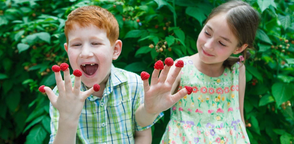
Frootz is a juicy, natural, fruit sweet brand for kids from Whitworth’s. Our brief was to communicate a new 100% fruit proposition which was fun as well as being virtuous.
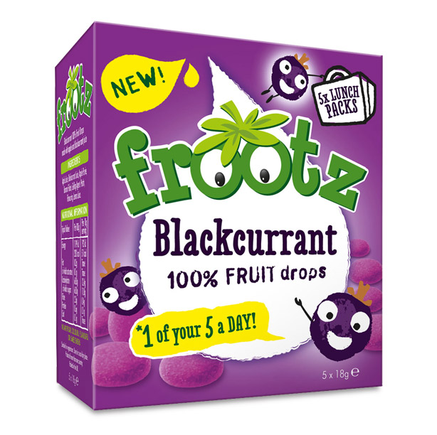
The new Frootz recipe was not only 100% fruit, but also gave you “1 of your 5 a day” in each pack. Although still natural, the flavours had not been diluted so fruitiness and taste was key to delivery on pack. Nothing artificial or nasty in there!
Visual representation
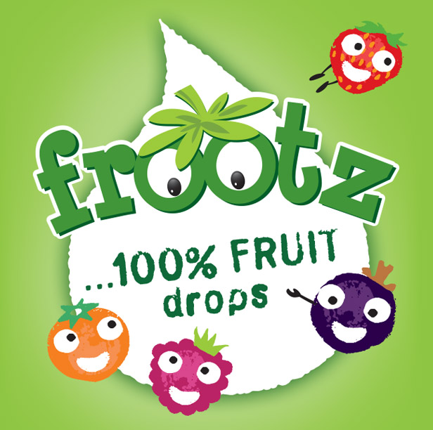
We created an architecture in the form of a juice droplet character icon to harness the brand logo and deliver the promise and flavour variety. Simple honest, natural fruit characters added an element of mischief and fun to appeal to kids. The characters were positioned highlighting the proposition and interacting with the benefits, they were set amongst the lovingly dusted fruit drops.
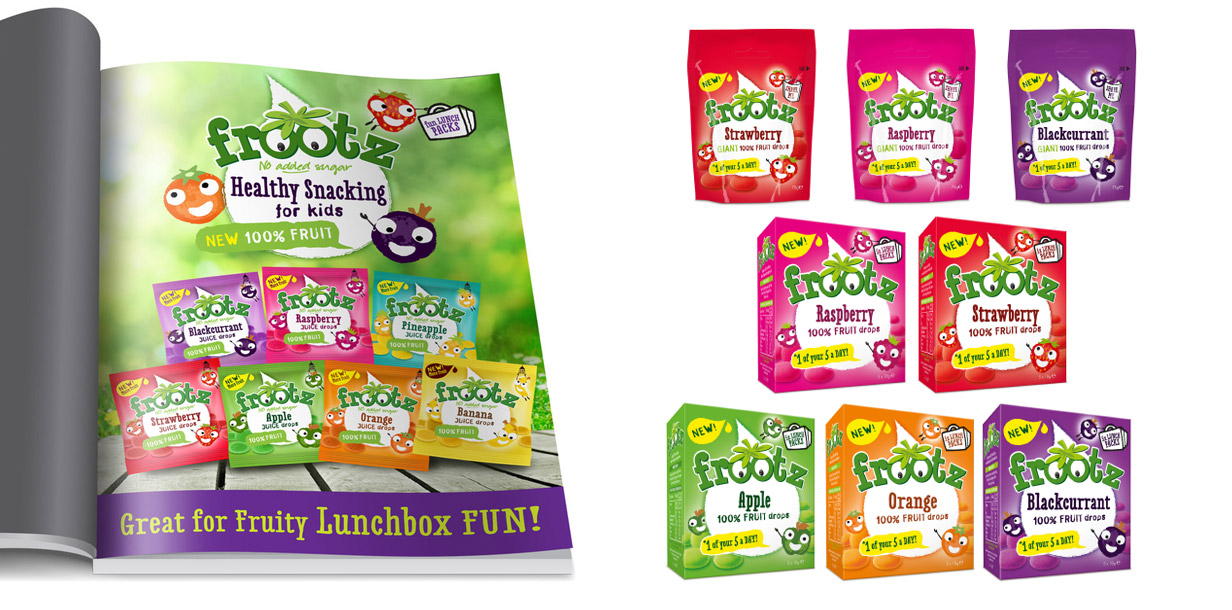
The design was implemented across a range of flavours, single bags and multipacks.We also explored concept ideas for the brand visualising sampling stands, adverts, POS and kids online activities to support the brand.