NIBL packaging redesign
Nibl is a classically cool, discerning snack brand for grown ups.
Our task was to create an evolutionary design for nibl that delivered the promise of uncompromised taste from goodness. Nibl cleverly balances the need for goodness as well as taste in a count-line snack for the contemporary body conscious 18-35 year old woman.


Visual representation on pack
Nibl’s touch of indulgence goes beyond the Whitworth’s fruit and snack positioning of healthy fruit and nuts. This new design created by Madeyoulook visually represents its “Nibl” name and proposition.
A range of bright poppy colours were selected for their high impact and taste cues. The calories were highlighted on each pack in the form of a roundel complementing the Nibl graphic.

Marketing support materials
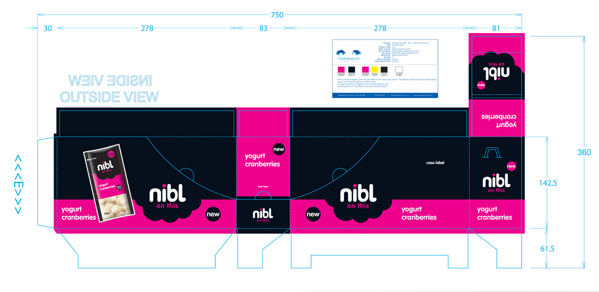
Madeyoulook created a range of marketing communications which included 3D visuals of SRPs with packs inside and various concepts for POS merchandising units which all stayed true to the brand promise to maximize the proposition.
We have a team of outstanding visualisers that can SHOW you your brand in its environment or in any pack format.
The result for Nibl is simple… a brand design which is easy to Nibl on!

