by Made You Look | May 7, 2017
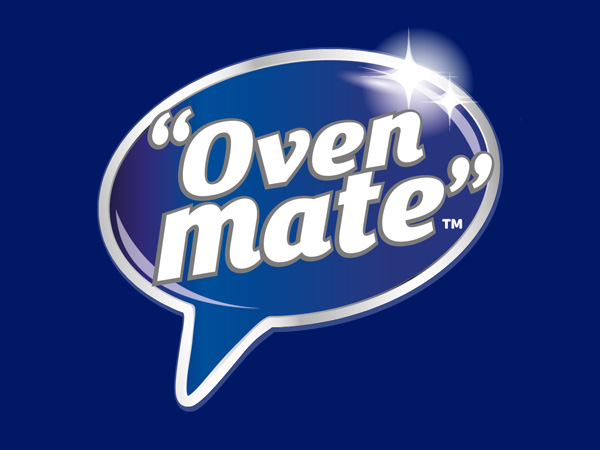
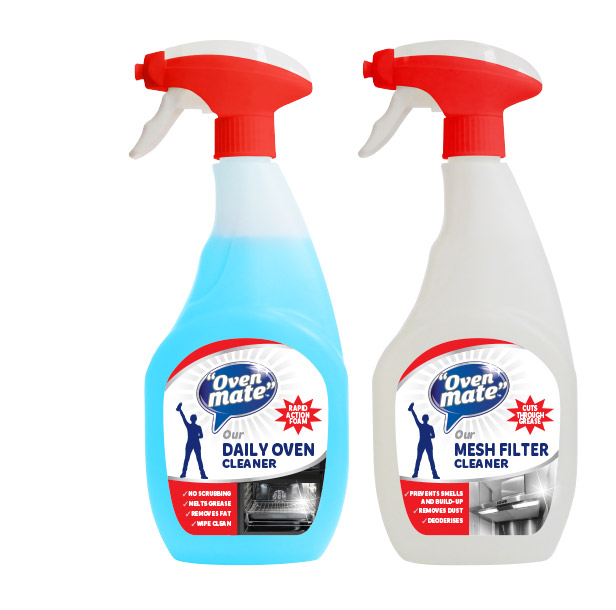
Oven Mate™ brand and packaging redesign
Oven Mate™ is an award winning, highly effective oven cleaning brand. The existing brand looked premium and conservative but lacked standout.
Madeyoulook created a personality for the brand through the name, adapting the existing brand mark into a speech bubble, giving the brand a unique identity that is both approachable and memorable. The brand is now seen as a hard-working reliable brand you can trust, a helpful brand who is always there when you need them, just like a true friend!
Future direction focus board
The Oven Mate™ focus board was created as a future direction for the pack design. This showcased key ideas, icons, colours and graphics, presented to the client prior to design development.
Our experience of this market helped us understand that power was important to the brand for efficacy. The power cleaning woman icon and red were incorporated, along with silver and blue for existing brand recognition. The personality and tone of voice for the brand was friendly and approachable.
Results
The new branding has resulted in opening many new accounts for our client by showing the new extensive premium range of 10 SKUs which is seen as having high visual appeal, created and designed by Madeyoulook.
The turnover for the Oven Mate™ brand has increased 30% year on year (2015 /16) and sales in 2017 are up by 20% on last year, in the first three months. Oven Mate™ Cleaning Kit has been awarded an approved product for the Good Housekeeping Institute.
by Made You Look | May 6, 2017
Brand Implementation
Jarlsberg® is a Norwegian cheese brand owned by Tine, Norway’s largest producer, distributor and exporter of dairy products. Madeyoulook was given the task of implementing the new Global brand identity across the UK, Europe and the USA.
As a brand specialist of over 40 years, we have worked with many global and multilingual brands with strict brand manuals and corporate guidelines. We understand the importance of adhering to guidelines but we also bought the brand to life in its new environment wherever it is in the world, with each country also having its own set of rules.
You can be assured 100% that your brand is safe in our hands.
Packaging & NPD
The sweet and nutty taste of Jarlsberg® was important to communicate as well as the usage which is different across the world, especially in Europe where Jarlsberg® is also eaten at breakfast.
Madeyoulook created slices, minis, wedge packs & grated which included a range of stickers on launch, additional to the graphics to address the usage issue.
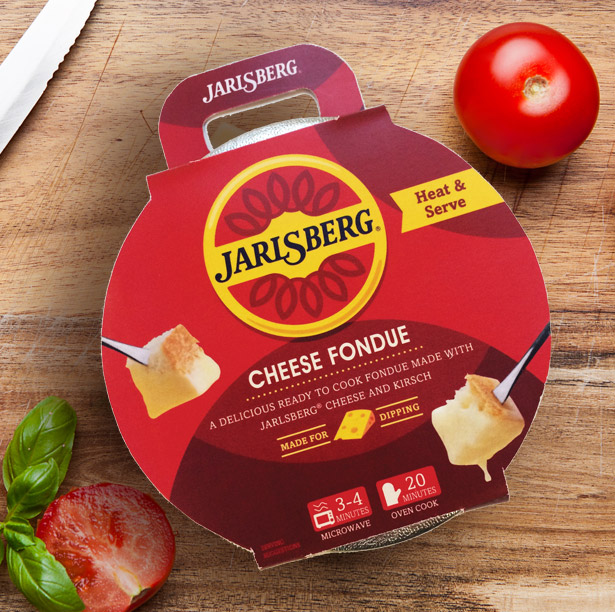
We have worked on a number of NPD concepts, the latest being Jarlsberg cheese fondue.
Brand communications
“Yours to Share” is the positioning strategy for Jarlsberg®. The advertising campaigns we created are based around this strategy with the latest campaign being “Jarlsberg® and Friends”….nothing brings friends together like Jarlsberg.
Madeyoulook have created retail packaging, SRPs, brochures, menu booklets, POS materials, promotional gifts, exhibition stands, sales brochures, sampling stands & flags, on pack promotions and advertising for the Jarlsberg® brand.
by Made You Look | May 5, 2017
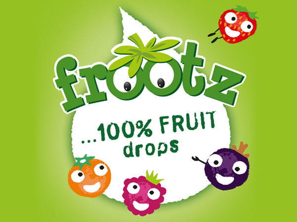
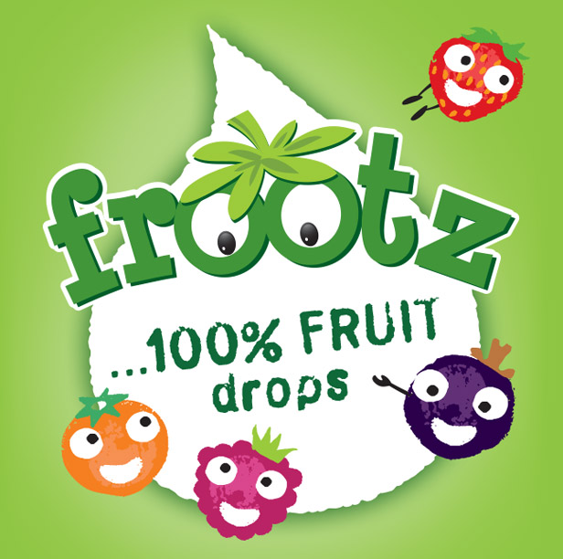
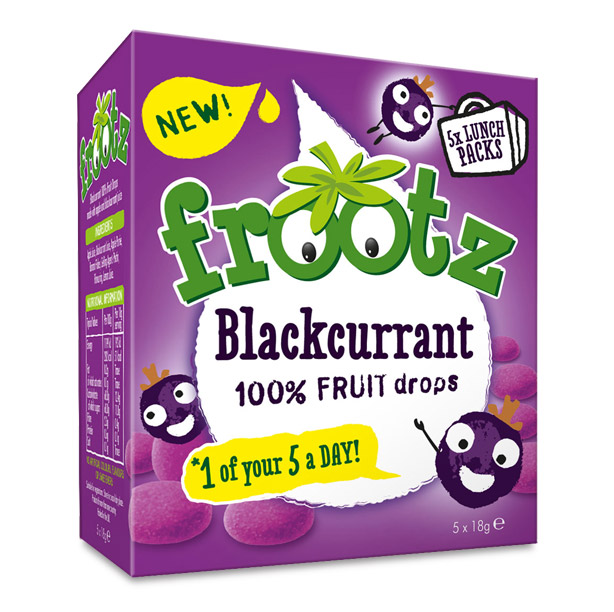
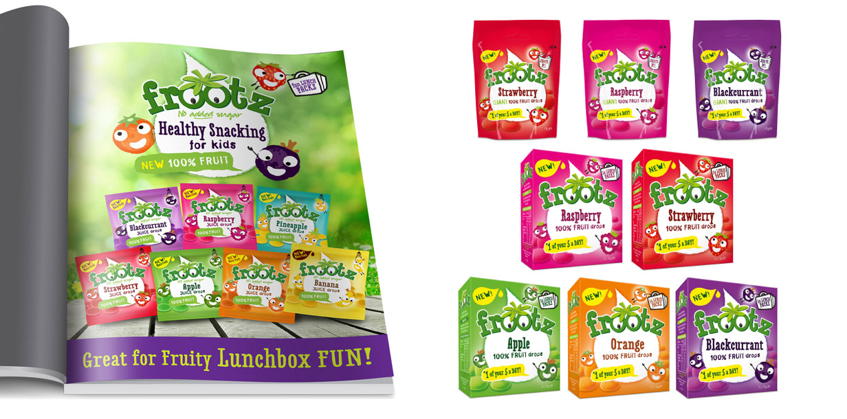
Frootz packaging redesign
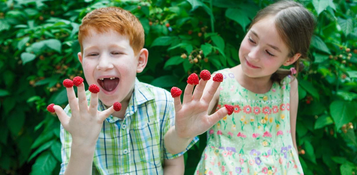
Frootz is a juicy, natural, fruit sweet brand for kids from Whitworth’s. Our brief was to communicate a new 100% fruit proposition which was fun as well as being virtuous.
The new Frootz recipe was not only 100% fruit, but also gave you “1 of your 5 a day” in each pack. Although still natural, the flavours had not been diluted so fruitiness and taste was key to delivery on pack. Nothing artificial or nasty in there!
Visual representation
We created an architecture in the form of a juice droplet character icon to harness the brand logo and deliver the promise and flavour variety. Simple honest, natural fruit characters added an element of mischief and fun to appeal to kids. The characters were positioned highlighting the proposition and interacting with the benefits, they were set amongst the lovingly dusted fruit drops.
The design was implemented across a range of flavours, single bags and multipacks.We also explored concept ideas for the brand visualising sampling stands, adverts, POS and kids online activities to support the brand.
by Made You Look | May 4, 2017
Packaging redesign
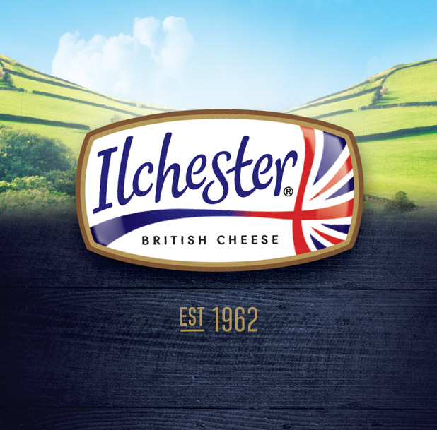
Ilchester® Cheese are innovative cheese specialists who create the most wonderful British cheeses which they combine with lots of delicious ingredients. They are always coming up with new modern ideas to excite their customers!
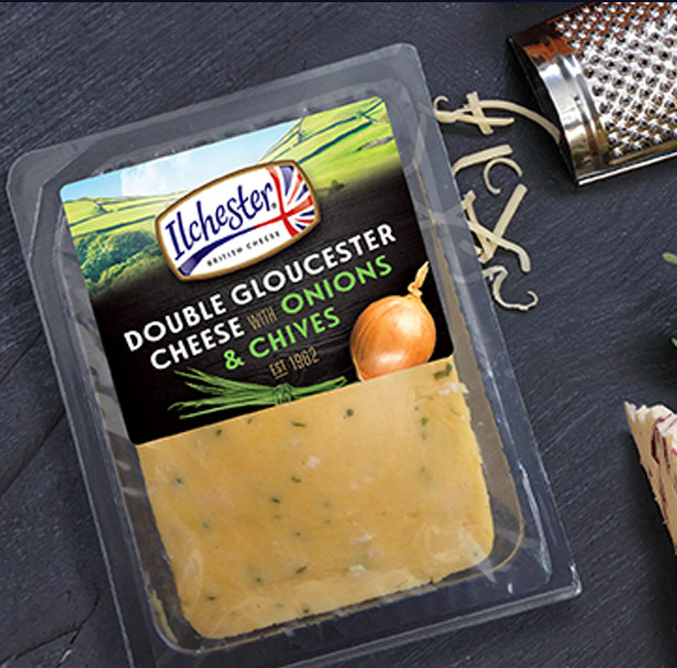
As a long-standing client, our task was to redesign the whole range of blended and regional cheeses as well as the core sub brands within the range. They wanted to retain their British Somerset heritage, achieve greater standout and bring forward the ingredients in a contemporary appealing way.
Owning British cheese
Madeyoulook created the master logo for the Ilchester brand several years ago, taking ownership of “Quality British Cheese” in the UK and internationally. The brand mark remains the focal point of the new pack design when combined with the Somerset countryside for both regional & blended cheeses.
The angled logo was introduced on the re-design to maximize its impact in store. Colourful ingredients were set against black wood to emphasise the taste creating a clean contemporary style. The cheeses look stylish & tasty and represent modern British cheese.
Sub brands
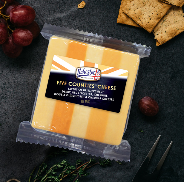
Beer Cheese has been synonymous with Ilchester® since 1962 when it’s founder Ken Seaton created the first Beer Cheese in his hotel in Somerset. Another favourite of Ilchester is Five Counties™ cheese, which brings the five best county cheeses together in one slice.
Sub brands require careful balancing to ensure the correct heiracy against the core brand. Brand image was enhanced behind the logo for each sub brand, in the form of beer barrels for Beer Cheese, and cheese wedges shaped in a union jack shape for Five Counties™. This allowed the sub brands to work in their own right and take ownership alongside the core brand.
by Made You Look | May 3, 2017
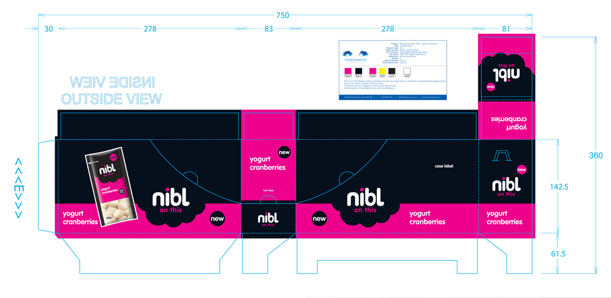
NIBL packaging redesign
Nibl is a classically cool, discerning snack brand for grown ups.
Our task was to create an evolutionary design for nibl that delivered the promise of uncompromised taste from goodness. Nibl cleverly balances the need for goodness as well as taste in a count-line snack for the contemporary body conscious 18-35 year old woman.
Visual representation on pack
Nibl’s touch of indulgence goes beyond the Whitworth’s fruit and snack positioning of healthy fruit and nuts. This new design created by Madeyoulook visually represents its “Nibl” name and proposition.
A range of bright poppy colours were selected for their high impact and taste cues. The calories were highlighted on each pack in the form of a roundel complementing the Nibl graphic.
Marketing support materials
Madeyoulook created a range of marketing communications which included 3D visuals of SRPs with packs inside and various concepts for POS merchandising units which all stayed true to the brand promise to maximize the proposition.
We have a team of outstanding visualisers that can SHOW you your brand in its environment or in any pack format.
The result for Nibl is simple… a brand design which is easy to Nibl on!


Recent Comments